People
Mapping Experience: Hyehyeon Kwon's Urban Icons
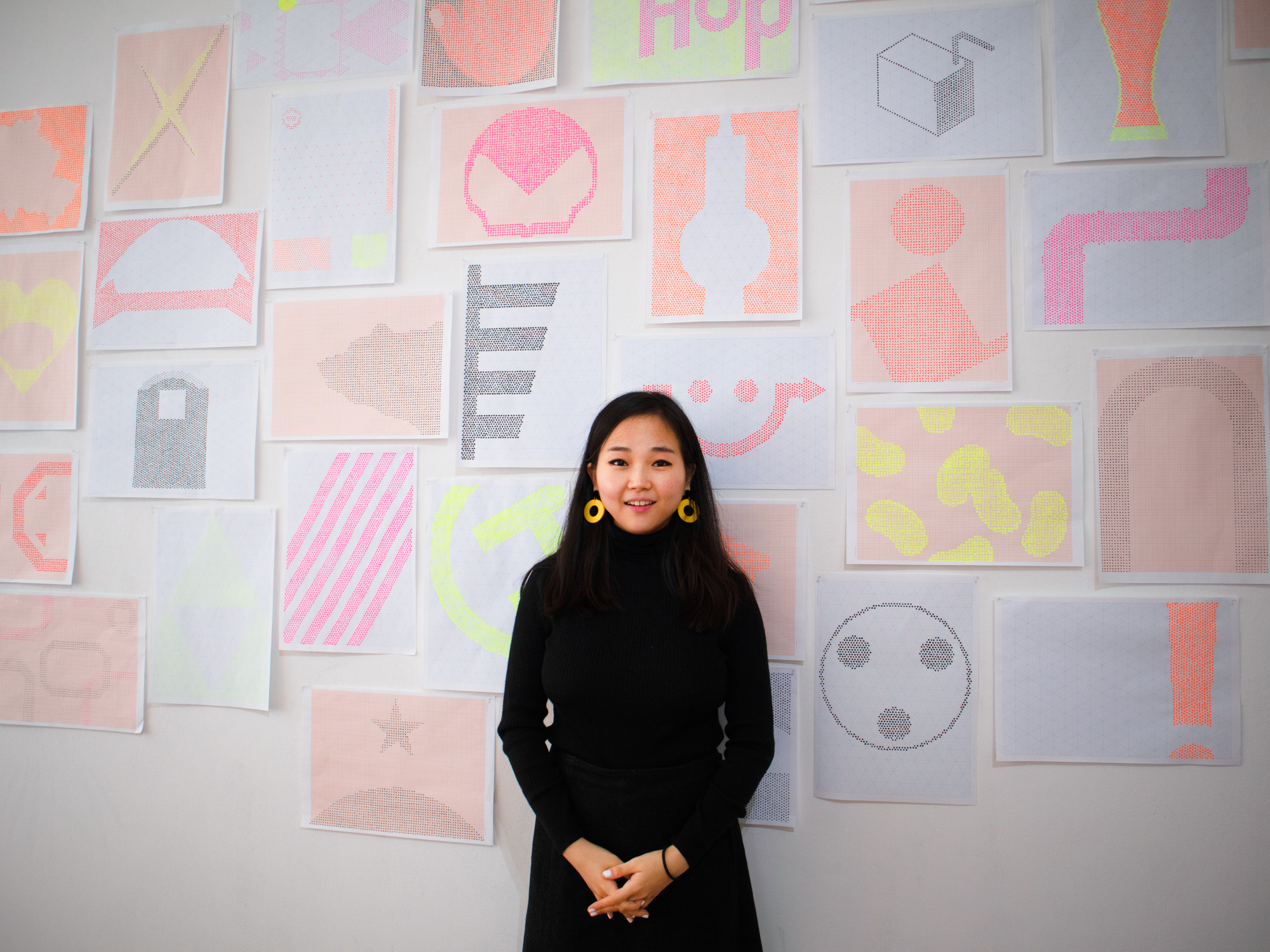

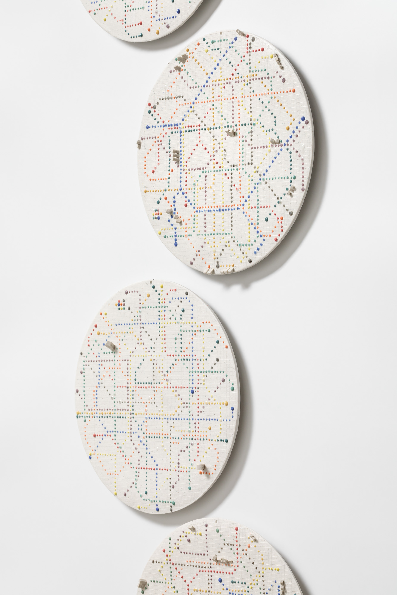
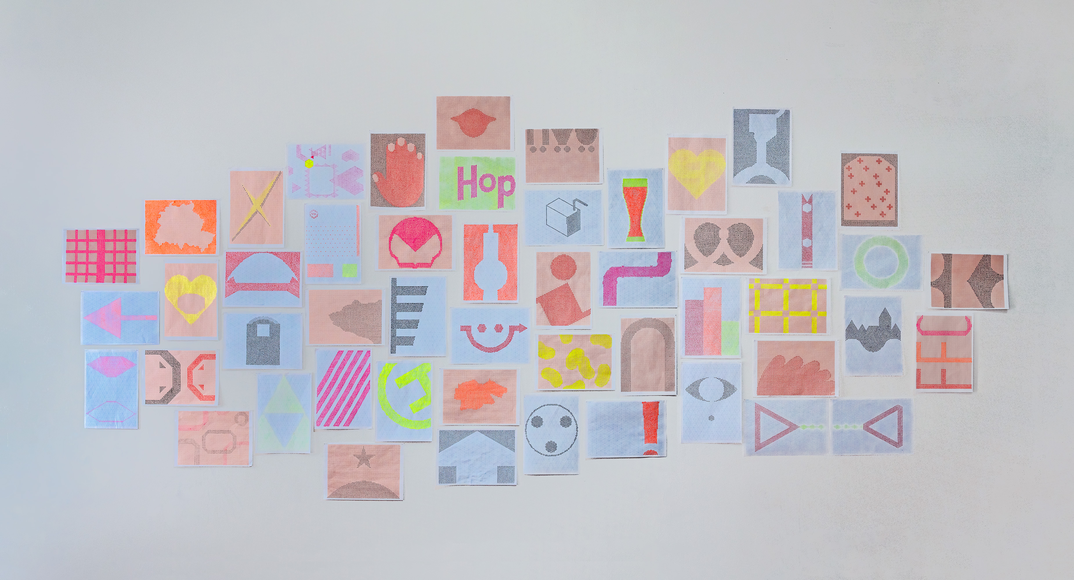
“Moveable Point,” South Korean ceramicist Hyehyeon Kwon’s exhibition at Berlin’s artist-run platform SomoS, showcased the results of Kwon’s recent three-month residency. For Seoul-based Kwon, her sojourn in Berlin was the catalyst for a new direction in her ongoing investigation into concepts of home, navigation, and place. Earlier in her practice she was fascinated in home as fixed, physical, and private dwellings, and in the means of getting there by way of imagined transportation networks. In Germany, however, she took note of informational, wayfinding iconographies as signifiers of home and as tools for orientation and perspective. Comprising drawings on paper and ceramic tiles that abstract maps, signs, and symbols from the public domain, the presentation was both idiosyncratic and communally familiar, and invited local audiences to see their own home from an alternative perspective. I spoke with the artist about the process of developing her artistic language and seeing a purlieu anew.
Recurring motifs of dots and grids in your new Berlin works and recent series such as Map Projection (2020) point to a methodical, systematic approach. Would that be a fair assessment of how you work?
My background and childhood have undoubtedly influenced my current work. In South Korea, if you want to go to a middle school and high school that specializes in the arts, you have to start preparing for the entrance exam at age 11, so I spent years drawing and practicing, sometimes for 12 hours a day. It was the same when I applied to university: I spent every day painting for the entrance exam. The effect was such that when I saw a blank canvas, I would feel anxious because I didn’t know how to start. When I got to university, I wanted to explore something different, so I started making ceramic objects. Some of my friends had similar experiences and now make work that is very loose and dynamic, but part of me still wants to feel stable and safe, which is why I favor step-by-step approaches. Perhaps that’s why my work is systematic and a little rigid.
From its associated language to its discovery in unfamiliar places, home is at the center of many of your works. Is that linked to this pursuit of safety and stability that you describe?
Yes, I think so. My work around this theme began with my own place—my emotional home—and from there expanded into other spaces, and the places and homes of other individuals. For me, my physical home has always been stable, peaceful, and comfortable. But my psychological home has often been fluid and flexible. I have often asked myself: My body and my apartment are in Seoul— but where is my soul’s home?
I started exploring these ideas with small “home icons,” which are miniature 3D ceramic models of buildings. They appear in many of my series, including Tube Map (2018), which comprises dreamed-up subway maps, and in another ceramic work called Pac Man (2018), which recalls the video-game character’s constant walking around, trying to find home. In the past, I've focused on abstract locations and the imaginary home of others, like in Non-Place (2020), which is based on airport departure boards but with made-up places. That idea developed into a series of maps, either of countries and continents in isolation or imagined locations. My approach to Berlin was different because it focuses on my personal experience and a specific place.
In discussing home, you’ve talked about the phenomenology of architecture—that is, the relationship between space, environment, and experience. How does that extend to the wider urban environment at the center of your Berlin work?
When I was pursuing my graduate degree, I drew on a 1975 essay by theorist D. Geoffrey Hayward called Home as an Environmental and Psychological Concept, which outlined some of the roles that we ascribe to “home,” such as intimacy. I take that idea in my work to imagine home as our first world and universe, a meaningful space of dreams and memories. I see home as not a passive entity but an active subject that gives comfort and stability, and that is subjective. With the Berlin works, I expanded this to include the surrounding space—the city—where I, the subject, exist.
Whether or not they depict actual places, ceramics feels at odds with the kind of specificity expected of tools such as maps or departure boards, partly because it’s prone to changes in the firing process. Is this juxtaposition a conscious choice?
It’s true: ceramics are really unpredictable! Even if I make a very accurate dot, in firing it might melt, or merge with another, or change color. That’s something that I find attractive: when you draw or paint, the final outcome will never change; with ceramics there’s a part I can’t control. In South Korea, makers will traditionally perform a ritual to appease the spirits before firing, and may offer some food or decorate the kiln with a talisman or charm to represent the fire god. I don’t do that—I just close my eyes and cross my fingers! But in terms of why ceramics, it’s a very classical and traditional material, and yet still quite uncommon in contemporary fine art. It’s still considered more of a craft and something for utility. I want to cross the boundary between ceramic and art.
It’s interesting that you talk about the dots’ propensity to merge in the firing process. When they don’t, or when they’re on paper, they look a lot like digital pixels, which also feel at odds with your more analogue approach.
Yes, so much of my work has been composed of small units. Previously, that has been multiple home icons, letters, and, more recently, dots. To me, a dot is an individual, or a moment. And many together make a whole. You said they make you think of pixels, which are bytes of information that collectively constitute a picture. My work is the same, I think.

The works you created at SomoS aren’t literal maps but do relate to a certain way of navigating Berlin. How did you settle on iconography as an approach to documenting the city?
Before I arrived in Berlin, I had a different project in mind. But that changed when I got here and saw how creative and multicultural the city is. The many symbols and icons here not only communicate information, they’re also pictograms and images created by designers and artists. On a practical level, when I arrived, I didn't know German, so I just focused on signs as that was all I could understand. Another reason why the iconography lent itself well to my work was because, in my projects, I try to keep a certain distance from my subject, while also sharing something universal that many people can connect with. I think that's art’s role.
You can see that the dot drawings [Urban Drawings, 2021] follow, step by step, some of the things that new arrivals in Berlin learn about the city: for example, first I focused on the symbols related to essential everyday life, like the signs for pedestrian crossings, U-Bahn stations, and the patterns on the windows of public transport. After that, I looked more closely around me at things like supermarket signs, gas stations, and so on. Finally, I looked to signs that point to culture in Berlin, including the Turkish flag that you see so often here [due to Berlin’s large Turkish community], the umlaut, and the “Pfand” logo for bottle recycling.
In the exhibition, your drawings on both paper and ceramic tiles are cropped or otherwise abstracted. Does this reflect the process of figuring out a new place—that is, the experience of discovery?
While my work does not speak directly to immigration or immigrants, I wanted to show the experience of individuals in a strange or unfamiliar place. The entire project at SomoS is a metaphor for that. I distorted some of the proportions of certain symbols, and noticed that even Berliners who are very familiar with them couldn't always immediately identify what they are. It’s ironic, because to me they’re now very familiar! The project is about making my own space and home here in Berlin, and also giving inhabitants a new perspective.
