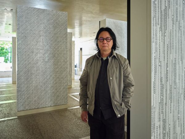
People
Following Intuition: Interview With Ian Woo
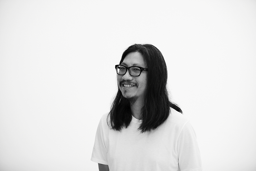
The visual language of Singaporean painter Ian Woo compels viewers to contemplate the power of form, color and space. Working in abstraction, Woo’s paintings explore the spatial relationships inside the pictorial plane. Woo, who completed his doctorate at the Royal Melbourne Institute of Technology in Melbourne, Australia, currently leads the Master of Fine Art program at La Salle College of the Arts in Singapore—all the while maintaining a very active artistic practice. Recently, ArtAsiaPacific sat down with Woo to talk about his painting process.

You have described your paintings as structures that you have built. Can you talk a little about this process of building? How does it begin?
Whether I’m working with canvases or paper, I see them as a kind of void that needs to be activated—[which I do] by painting [and making] marks, shapes or forms. Even applying a color [would be a way of] activating them. Once I start doing this, it triggers simultaneous things to happen . . . Sometimes it’s between myself . . . Sometimes the paint does something else. So it’s a bit like a dialogue.
How do you know when your work is completed?
Some paintings are easier to decide than others, but the painting is finished when it reaches a certain idea, visually. Once it gets there, I know it’s pretty much ready. Whether I want to go back and do some touchups in later years is another matter. It’s quite improvised. There is a point where, if I am not careful, [the painting could] get a bit overworked. It’s a thin line between getting something overworked and knowing when to stop.

How do you choose your color palette?
I think about color as elements. Grey is always the color that I start with, but there are so many variations of it. Grey is like a shadow. From there I decide whether I want “fire,” “light” or “water,” for example. I choose my colors based on this decision: in the beginning, each color represents a natural element. But when they arrive on the canvas they don’t necessarily represent these [elements] that I had thought about earlier. So that is the way I think about color—I don’t work with the color wheel. It’s very intuitive.
The aesthetic shifts in your work’s visual language—from the type of gestures to its color palette—used to be very rapid, but has significantly slowed down in recent years. Have you arrived at the answer you were looking for?
Over the last four years, I think I have been looking towards a different kind of [spatial configuration]; prior to that my works were a bit dense and packed. Recently, I have been playing with the idea of using a lot more space. But I am not always content with the kind of forms and [negative] space you see in classical or Zen paintings. I am trying to figure out how to have a relationship with the image or object within a particular space. It could look simple, but I want the relationship to be complex. So something can look simple, but hopefully, when you look at it long enough, you can see its more complex relationships [with its surrounding space]. So that is where I am at conceptually.
But, for example, We Have Crossed The Lake, my painting included in “After Utopia” [currently on view at the Singapore Art Museum] is from 2009. This painting has a classical look—very dense and object-like. It has many layers. You can feel its “object-ness” and the sense that there is a bit more logic to its spatial configuration, where there is the ground, the object and a central focus point. So the body is able to adjust [to it]. It is interesting, because a lot of people like that series, as it has aspects that are recognizable; but at the moment I do not intend to revisit that style.
Although your works are abstract, their titles tend to give a sense of a narrative hidden in the layers of the painting. Is this deliberate? Are we meant to form a narrative around the title?
There is this thing about abstract painting that likes to be “untitled,” but that doesn’t really work for me. I like to give [my works] a narrative title. For me it’s a kind of attempt at absurdity—wherein, looking at the work, viewers don’t see what is being described [in the title]. I play this game where I make these titles just to play with the viewers. You think you see [what the title is referring to], but it’s absurd if you do. Although, sometimes the paintings do provide illusionary clues and suggestions. The titles are usually poetry—like a song name or a love letter.